I typed “Nike” with “JUST DO IT” into MuleRun Chat and got back a 16:9 website hero section that looks like a real Awwwards-winning site. A massive 3D brushed-metal Swoosh dominates the right side, crimson-tinted and partially cropped by the frame. Editorial typography stacks “JUST / DO / IT” on the left in heavy condensed sans-serif. A minimal navbar floats at the top. “Est. in 1964” sits in the bottom corner. The whole image is lit by a single warm crimson light source that creates both the background radial glow and the metal highlights on the sculpture.
This prompt format was created by Amir Mushich on X and generates photorealistic website hero sections that combine 3D sculptural logo objects with editorial typography and minimal UI. The output is a design direction mockup, not code. It shows how the hero section should look and feel before a developer builds it.
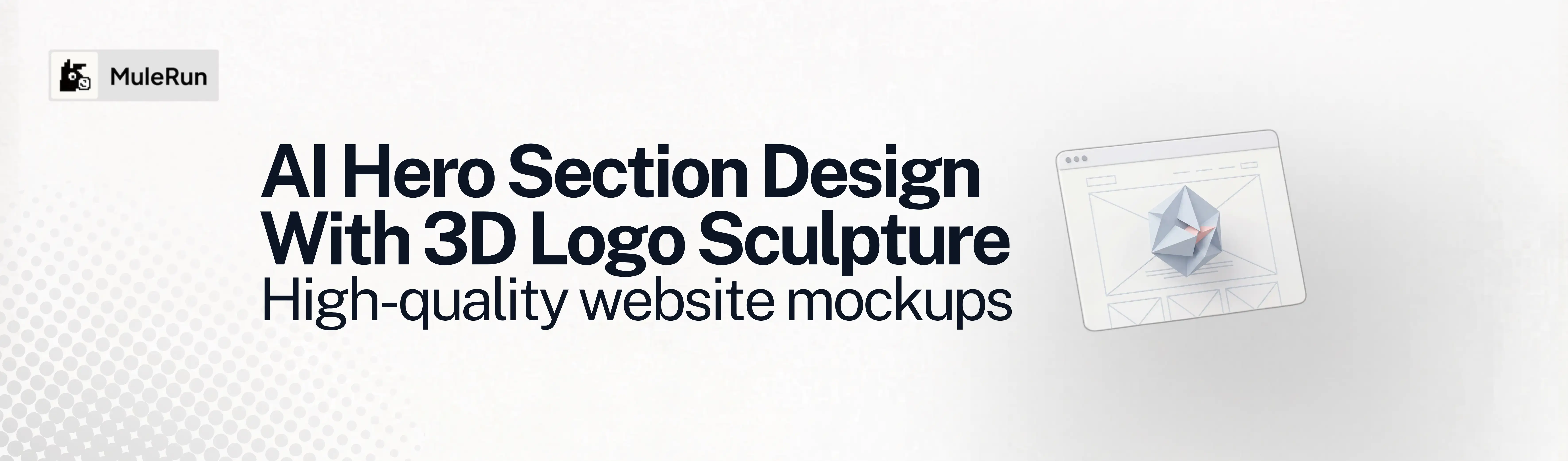
What Is a Hero Section?
A hero section is the first visible area of a website when a page loads, positioned above the fold. It typically contains the primary headline, a supporting subheadline, one or two call-to-action buttons, and a dominant visual element. The hero section sets the visual tone for the entire page and determines whether a visitor stays or leaves within the first few seconds.
A hero image is the visual component within the hero section. It can be a photograph, illustration, video background, or, in this case, a 3D rendered object. A hero banner is the full-width container that holds both the text and visual elements together.
Most hero section generators output code: React components, Tailwind CSS templates, or HTML wireframes. This approach is different. It generates a photorealistic mockup image that looks like a screenshot of a finished premium website. The mockup is a design concept, not a production file. It communicates the creative direction before any code is written.
How Do You Design a Hero Section With AI?
You design a hero section with AI by writing a phased prompt that first extracts the brand’s visual identity (colors, typography, symbol, founding year) and then applies it across six compositional layers: background gradient, 3D sculpture, navigation bar, text block, bottom elements, and lighting.
The prompt structure was created by Amir Mushich on X. It uses a single primary color to derive the entire image’s visual system: background gradient, 3D metal material, and atmospheric lighting all come from the same hue.
Here is the full prompt:
[BRAND NAME] | [HEADLINE = user text or AUTO] | [SUBHEADLINE = user text or AUTO] | [BUTTON TEXT = user text or AUTO] | [COLOR = your color or AUTO]

Act as a Senior Web Art Director and CGI Artist creating a photorealistic hero section of a premium brand website — a single wide-format image showing the full above-the-fold view of a hero webpage. The composition combines a dramatic 3D sculptural logo object with editorial typography and minimal UI elements.

PHASE 0: BRAND INTELLIGENCE
Perform a complete brand decode of [BRAND NAME]. Every visual decision derives from this phase.
COLOR SYSTEM: if COLOR is provided, use that exact color as primary driver. If AUTO, identify the exact primary brand color from official guidelines. This one color drives the entire image: background gradient, 3D object material, atmospheric lighting.
BACKGROUND GRADIENT: from the primary color derive two stops. Inner: most saturated vivid version at full intensity. Outer: darkest possible version of the same hue near black but with visible trace of the hue remaining.
3D OBJECT MATERIAL: from the primary color derive the metal material. Base/shadow: darkest near-black color-tinted metal. Highlight: vivid saturated version on edges facing light. Mid-tone: medium value on 45-degree surfaces. No neutral grey metal. The metal has the brand color in its DNA.
TYPOGRAPHY: identify official typeface character. Apply consistently.
BRAND SYMBOL: identify the most iconic reduced form of the logo. This becomes the 3D sculptural object.
BRAND LANGUAGE: if HEADLINE is AUTO, extract the most powerful real brand statement. If SUBHEADLINE is AUTO, extract a real brand descriptor. If BUTTON TEXT is AUTO, identify the primary CTA phrase.
FOUNDING YEAR: extract for bottom corner attribution.

PHASE 1: BACKGROUND
Full-bleed radial gradient emanating from center-right. Inner zone: saturated vivid color, 40-50% of background area. Outer zone: very dark tinted black at all edges. Soft organic atmospheric fade, not hard edge. Sensation of warm spotlight behind the 3D object.

PHASE 2: 3D LOGO SCULPTURE
Brand symbol as massive three-dimensional sculptural object. Occupies right 55-65% of image. Partially cropped by right and bottom frame edges. Rotated 20-35 degrees vertical, 10-20 degrees horizontal. Camera 5-10 degrees below center.
Material: premium dark brushed metal. Fine parallel directional micro-scratches. Edge highlights trace full logo geometry. Contrast between near-black shadow faces and vivid highlighted edges is the defining characteristic. Scale feel: monumental, 3-5 meters in physical space.

PHASE 3: NAVIGATION BAR
Top 4-5% of image. Dark semi-transparent background. Left: brand wordmark in white. Center: 4-6 navigation categories in small all-caps tracked white type. Right: language switcher pill and primary CTA button with right arrow.

PHASE 4: TEXT BLOCK
Left 35-40%, vertically centered. Label line: small bracketed label "{ WE ARE [BRAND NAME] } →". Headline: bold uppercase or sentence case per brand convention, 8-10% of image height per line, white, 2-3 lines. Body: 1-2 sentences at 70-80% opacity. Two CTA buttons: primary dark fill with white border, secondary outline only.

PHASE 5: BOTTOM ELEMENTS
Bottom left: "Scroll for more ↓" in small white type. Bottom right: "Est. in [FOUNDING YEAR]" in small white type.

PHASE 6: LIGHTING
Single primary warm dramatic light behind and upper-right of 3D object. Light color is the vivid primary color. Creates both background glow and metal highlights — same light, same color, same source. Secondary: 5% cool ambient from above lifting darkest shadows. No fill lights. Dramatic contrast preserved.

PHASE 7: COMPOSITION
16:9 landscape. Left 35-40%: text zone. Right 60-65%: sculpture zone. No overlap between text and object. Reading direction: text left, sculpture right.

PHASE 8: TECH SPECS
Octane/Redshift render quality. All material colors from primary color. Ray tracing for edge highlights and metal inter-reflections. Typography: crisp anti-aliased flat white. UI: clean flat design, no drop shadows. Output feel: actual above-the-fold screenshot of a relaunched premium website.
Replace [BRAND NAME] with any brand. The four input fields (headline, subheadline, button text, color) can all be set to AUTO for the AI to extract real brand language, or you can provide your own copy.
What Makes a Hero Banner Convert?
A hero banner converts when it establishes a clear visual hierarchy: one dominant visual element, one headline, one primary action. The prompt structure enforces this through spatial separation. Text occupies the left 35-40% of the frame. The 3D sculpture occupies the right 60-65%. They do not overlap.
Three layout principles from the prompt that apply to any hero section design:
- Single light source: one dramatic light creates the background atmosphere and the product highlights simultaneously. This unifies the composition. Multiple light sources fragment attention
- Asymmetric balance: the text block is smaller and lighter (white type on dark background). The sculpture is larger and heavier (monumental metal). The asymmetry creates visual tension that pulls the eye across the page from left to right
- Anchoring details: “Est. in 1964” in the corner and “Scroll for more ↓” at the bottom give the hero section the feel of a real website rather than a floating graphic. These small elements add credibility to the mockup
The Nike hero section generated in MuleRun Chat used these principles with Crimson Red (#CC0000) as the single primary color. The gradient inner stop was vivid crimson. The gradient outer stop was #1A0000, near-black but still red-tinted. The brushed metal Swoosh picked up crimson highlights on edges facing the light and faded to near-black on shadow faces. Every color in the image traces back to one hex value.
Can AI Generate a Full Landing Page Mockup From One Prompt?
AI can generate a hero section mockup from one prompt because the hero section has a constrained composition: one background, one visual element, one text block, one navigation bar. A full landing page has multiple sections with different layouts, content types, and visual hierarchies, which makes it harder to control in a single generation.
The practical workflow is to generate the hero section first (using the prompt above), then generate individual section mockups as follow-up prompts in the same session. The AI carries the color system, typography, and brand language forward, so each section is visually consistent with the hero.
For a complete landing page design concept, the sequence looks like this:
- Hero section: the prompt above
- Features section: “Create a features section for the same website, 3-column grid, each column has an icon, headline, and description, same dark background and color system”
- Testimonial section: “Create a testimonial section, single large quote with attribution photo, same design language”
- Footer: “Create a minimal footer with the same navigation categories, social links, and newsletter signup”
Each prompt in the sequence is short because the session context carries the design system. The hero prompt does the heavy lifting. Everything after it is an extension.
MuleRun Chat generated the Nike hero section using Nano Banana 2 at 4K resolution (16:9). The output was a 16MB PNG published to a Mule Page for direct sharing. The generation took one prompt and produced a presentation-ready mockup.
Start Building
Sign up for free credits and use the hero section template to generate your own 3D logo hero from one prompt.
Frequently Asked Questions
What Is the Difference Between a Hero Section and a Hero Image?
A hero section is the full above-the-fold area of a website including headline, subheadline, call-to-action buttons, navigation, and visual elements. A hero image is just the visual component within that section. This prompt generates the complete hero section as a single mockup image.
Does This Prompt Output Code or an Image?
It outputs a photorealistic mockup image, not code. The image looks like a screenshot of a finished website and is used as a design direction reference before development begins. To build the actual page, hand the mockup to a developer or use it as a visual brief.
What Brands Work Best With This Format?
Brands with a strong standalone symbol or monogram produce the most dramatic 3D sculptures: Nike (Swoosh), Apple (apple icon), Mercedes (star), Starbucks (siren). Brands with wordmark-only logos use the first letter of the name as the 3D form.
Can You Override the Brand Colors With a Custom Color?
Yes. Set the COLOR field to any hex value or color name and the entire image derives from that color: background gradient, metal material, and lighting. This is useful for campaign-specific colorways or product launches that use a different palette than the main brand.
What Resolution and Model Should You Use?
Nano Banana 2 at 4K resolution (16:9) produced the best results in the Nike session. GPT Image 2 at 1536x1024 is a reliable alternative. The hero section format is less complex than the 8-card moodboard, so higher quality settings and resolutions work without timing out.