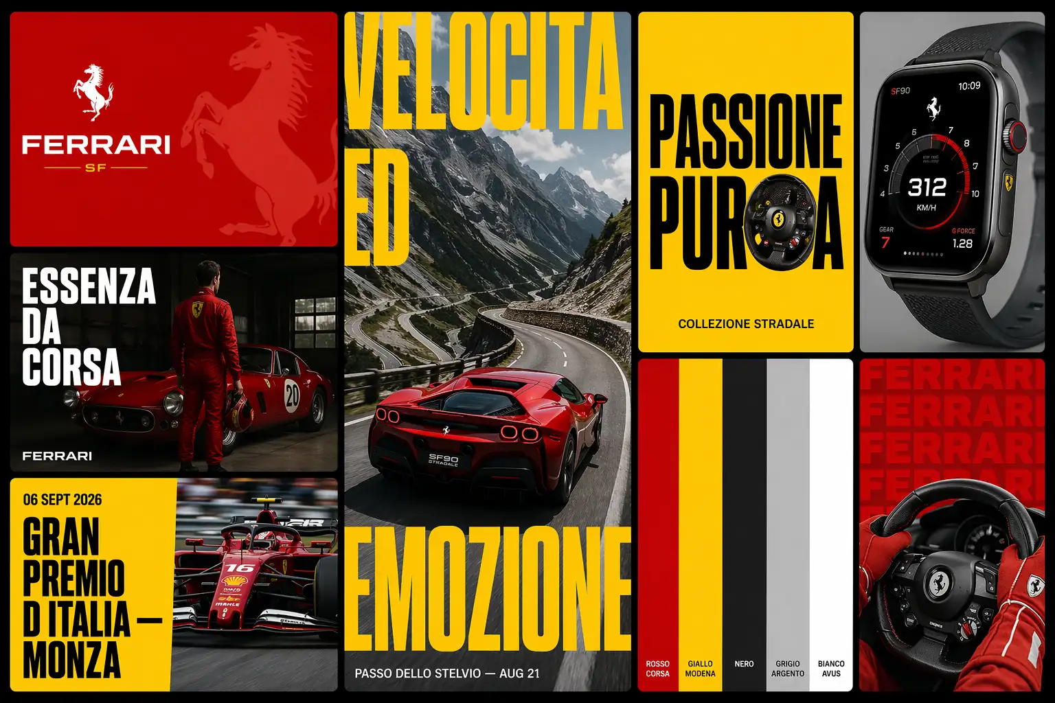
I typed “Ferrari” into MuleRun Chat with a structured prompt and got back a single 16:9 image containing eight cards: a Rosso Corsa logo lockup, an editorial photo with “ESSENZA DA CORSA” in geometric sans-serif, a Giallo Modena event announcement for Gran Premio d’Italia, a full-bleed story card of the SF90 Stradale on Passo dello Stelvio, a typographic poster, the exact Ferrari color palette, a product mockup, and a typography pattern card. One image. One prompt. A complete brand identity system.
This prompt format was created by Amir Mushich on X and uses a phased approach where the AI first extracts real brand data (colors, typography, slogans, product names, cultural context) and then applies that data across eight distinct card types arranged in an asymmetric grid. The result looks like a brand identity case study published on Behance or a brand agency pitch deck.
What Is a Brand Identity Moodboard?
A brand identity moodboard is a single visual document that shows how a brand’s core elements (logo, color palette, typography, photography style, and campaign language) work together as a system. Each element is demonstrated through a different application: logo lockup, editorial photo, event announcement, social story, typographic poster, color palette reference, product mockup, and typography pattern.
Brand identity services from agencies typically produce these as multi-page PDF decks. The AI version compresses the full system into one image that communicates everything at a glance.
The 8-card format works because each card tests the brand system in a different context. A logo that looks strong in isolation might clash with editorial photography. A color palette that reads well on screen might fail when applied to a typographic poster. The grid forces the system to prove itself across applications.
How Do You Generate a Brand Identity System With AI?
You generate a brand identity system with AI by using a phased prompt that separates brand intelligence extraction (Phase 0) from visual execution (Phases 1-9). The AI first identifies the brand’s real colors, typography, slogans, and cultural world, then applies that data consistently across all eight cards.
Here is the full prompt, adapted from Amir Mushich on X:
[BRAND NAME]

Act as a Senior Brand Identity Designer and Art Director creating a comprehensive brand identity moodboard — a single image composed of 8 cards arranged in a dynamic asymmetric grid on a black background. The entire system is driven exclusively by [BRAND NAME]'s real brand guidelines, real color palette, real typography, real campaign language, and real cultural context. Every card demonstrates a different application of the same brand system.

PHASE 0: BRAND INTELLIGENCE — STRICT EXTRACTION FROM REAL GUIDELINES

Perform a complete brand decode of [BRAND NAME] from training data. This phase drives every visual decision in all 8 cards.

COLOR PALETTE — EXACT: identify the complete official color palette of [BRAND NAME] as documented in their brand guidelines. Extract primary brand color (the most iconic, most used color), secondary brand color, neutral (black or white depending on brand), and any accent colors. These are the ONLY colors used across all 8 cards. No approximations. No substitutions.

TYPOGRAPHY — VISUAL CHARACTER: identify whether [BRAND NAME] uses serif, sans-serif, condensed, extended, or script type in their brand communications. Describe the visual character precisely — weight, contrast, tracking, capitalization style. Apply this character consistently across all 8 cards.

BRAND LANGUAGE: extract real [BRAND NAME] campaign slogans, real product names, real event names, real founding information, real geographic origin, real brand manifesto phrases. All text across all 8 cards is real [BRAND NAME] language — zero invented copy, zero generic phrases.

BRAND WORLD: identify the visual world [BRAND NAME] inhabits — sport, luxury fashion, technology, food, music, streetwear, or other. Every photographic element, every prop, every context across all 8 cards must belong to this specific brand world.

PHASE 1: GRID ARCHITECTURE
Single flat image, 16:9 landscape. Black background (#000000) filling all gaps. 8 cards in asymmetric dynamic grid with varying sizes for visual rhythm. Rounded corners 8-12px. Uniform gap 8-12px. Three columns of varying widths.

PHASE 2: CARD 1 — LOGO LOCKUP (top left, horizontal)
Background: primary brand color. Logo or wordmark in correct official form. Oversized abstract graphic element derived from logo mark, partially cropped. No photography. Pure brand identity graphic.

PHASE 3: CARD 2 — EDITORIAL PHOTO (left middle)
Dark-toned editorial photograph relevant to brand world. Multi-line headline in brand's typographic style — a real manifesto phrase or campaign slogan, bold, left-aligned. Brand wordmark at bottom.

PHASE 4: CARD 3 — EVENT ANNOUNCEMENT (bottom left, wide horizontal)
Background: primary accent color at full saturation. Large headline announcing a real event, campaign, or product launch. Dynamic action photograph on right, partially cropped to edge.

PHASE 5: CARD 4 — STORY FORMAT (center, tall vertical)
Mobile story proportions. Full-bleed photograph. Oversized display typography spanning multiple lines, partially cropped by card edges. Small date or location detail.

PHASE 6: CARD 5 — TYPOGRAPHIC POSTER (upper center-right)
Vivid accent color background. Large headline where one word has a photographic object replacing a key letter. Real campaign phrase. Purely typographic and graphic.

PHASE 7: CARD 6 — COLOR PALETTE CARD (center lower)
Brand colors as vertical stripes, full height. Each stripe labeled at bottom. Clean and precise. Direct brand guidelines reference.

PHASE 8: CARD 7 — PRODUCT MOCKUP (upper right)
Photorealistic mockup of a physical product or digital interface branded with the identity. Neutral studio background. Accurate branding on product.

PHASE 9: CARD 8 — TYPOGRAPHY PATTERN (lower right)
Brand name repeated as all-over typographic pattern. Cropped editorial photograph overlaid, partially obscured by type. Pattern color is primary brand color.

PHASE 10: UNIFIED SYSTEM
All 8 cards use only the colors from Phase 0. All typography uses the character from Phase 0. All text is real brand language. All photography belongs to the documented brand world. A person who knows [BRAND NAME] must immediately confirm it belongs to that brand.

PHASE 11: TECH SPECS
Single flat image, 16:9. Consistent rounded corners. Uniform gaps. Crisp typography, zero shadows. Exact brand colors. Editorial quality photography. Output feel: professional brand identity case study on Behance.
Replace [BRAND NAME] with any brand. The Phase 0 extraction ensures the AI uses real brand data rather than inventing colors or slogans.
What Did the Ferrari Brand Moodboard Look Like?
The Ferrari moodboard generated in MuleRun Chat used the following real brand data extracted during Phase 0:
- Rosso Corsa (#CC0000): primary brand color across logo lockup and typography pattern cards
- Giallo Modena (#FFD700): secondary color on the event announcement and typographic poster cards
- Typography: bold, high-contrast geometric sans-serif display type, strict uppercase, tight letter-spacing
- Real slogans: “Essenza da Corsa”, “Passione Pura”, “Velocità ed Emozione”
- Real events: Gran Premio d’Italia, Monza, Scuderia Ferrari
- Real products: SF90 Stradale, Daytona SP3, 296 GTB, Purosangue
Every card used only these colors and this language. The editorial photo showed a Scuderia driver in dimly lit garage. The story card placed the SF90 Stradale on Passo dello Stelvio with oversized Giallo Modena type. The typographic poster replaced the O in “PURA” with a close-up of a carbon fiber steering wheel.
The model used was GPT Image 2 at 1536x1024 resolution. A key lesson from this generation: complex 8-card compositions time out at high quality settings. Medium quality at 1536x1024 produces strong detail without hitting generation limits.
How Does This Help With Branding and Brand Strategy?
This format helps with branding and brand strategy by forcing the brand system to prove itself across eight different applications in a single image. It exposes weaknesses that a logo-only review misses: does the palette work on photography? Does the typography hold at display size and at caption size? Does the brand language feel authentic when applied to an event poster versus a product mockup?
For branding for small business, the 8-card moodboard is a fast way to test a new brand identity before committing to full production. Generate the moodboard, review whether the system holds across all eight applications, adjust the brief, and regenerate. The iteration cycle that takes an agency two weeks takes one chat session.
The output also works as a client-facing deliverable. A freelance designer can generate the moodboard, refine it, and present it as a brand direction exploration. It does not replace the strategic work of positioning, audience research, or competitive analysis. It accelerates the visual exploration that follows the strategy.
Start Building
Sign up for free credits and generate your brand identity moodboard from this template .
Frequently Asked Questions
What Brands Work Best With the 8-Card Format?
Brands with strong visual identity systems produce the most accurate results: Nike, Apple, Ferrari, Adidas, Supreme, Spotify. Newer or smaller brands work too, but the AI may approximate colors or typography where training data is limited. For those cases, add hex codes and font names directly to the prompt.
How Accurate Are the Brand Colors in the Output?
The AI extracts colors from its training data, which includes brand guidelines, packaging, and campaign materials. For major brands, the colors are typically within a few shades of the official palette. For precision, add exact hex codes to the Phase 0 section of the prompt.
Can You Edit Individual Cards After Generation?
The output is a single flat image, not a layered file. To change one card, adjust the phase description for that card in the prompt and regenerate. The generation process handles the full 8-card composition in one pass.
What Resolution Should You Use?
1536x1024 at medium quality produces the best results for 8-card compositions. Higher resolutions and quality settings tend to time out on complex multi-element images. The output is sharp enough for screen presentations and social sharing.
Does This Replace Brand Identity Services From an Agency?
It replaces the visual exploration phase: moodboarding, direction-setting, and application testing. It does not replace brand strategy, market research, competitive positioning, or the human judgment that shapes a brand’s long-term direction. Use it to explore visual options faster, then bring a strategist in for the foundational decisions.